Categories
Notices and info dialog modals Rants UX error messages

Doing it all wrong – Errors and info dialog modals

Hey Designers,

Let’s talk about handling errors effectively for our users.

Problem

Have you ever noticed how the system surprises us with a dialog box when we make a mistake? It’s like, “Ta-da!” Here’s a fancy message to decode, along with two vague buttons to choose from. This usually happens unexpectedly and disrupts our workflow, which can be frustrating. The dialog box covers the screen, making it hard to remember what we were doing before the error occurred. The background dimming effect just adds to the annoyance. After struggling to read the message, we end up hitting the ‘back’ button out of sheer frustration.

Solution

Here’s a simple solution: Instead of a complex message, provide a clear arrow pointing to where the user made the mistake. Use one or two buttons with straightforward labels for fixing the issue. For example, if the user exceeds a limit, like entering “30” when the limit is 25: Instead of saying “Limit exceeded, try again,” say “Must be more than 0 and less than 25.”

Clear labels on simple buttons and highlighting the error location on the page will provide context without covering up the work area. Once you give the user the solution, you can add creative elements like rainbows and unicorns for visual appeal, but keep the focus on providing a clear answer.

If there are more than two choices, it’s time to review the UX/UI flow of that feature. Good design can prevent most errors. And if it all feels overwhelming, take a break and relax. Sometimes, a break and a deep breath are the best solutions!


Categories
Festivals

A Honey Hive debuts at the Herbfest, Stillwater, OK

Thank you to all who stopped by and supported buying Local Honey. My father would have loved to have been their taking part in person, but I know he was there in spirit.

Jars of honey glowing in the sun
Honey glowing in the sunlight out on my dad’s property.
Gary W. Breisch 1949 - 2022, tending to his bees with love.


Bee kind, bee well, and thank you for bee-ing.

Categories
Clients Ecommerce GUI Design UX Design Website

Performance Product Technologies Website

Perfprotech.com Boats Products Category Page View Prototype

Provided Graphical User Interface and User Experience Design for the Perfprotech.com Ecommerce Website Re-design.

Categories
Clients Website

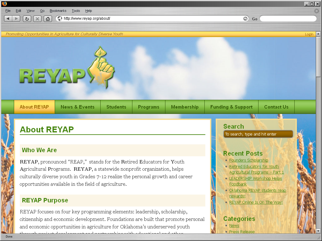
REYAP Website

Solid Line Design launches the REYAP Website, kicking-off the start of their online communications.

REYAP Website Screenshot - Showing the About page

REYAP, pronounced “REAP,”  stands for the Retired Educators for Youth Agricultural Programs.  REYAP, a statewide nonprofit organization, helps culturally diverse youth in Grades 7-12 realize the personal growth and career opportunities available in the field of agriculture.

Making information easily available on the web to existing and potential students was a primary objective.  REYAP’s opportunity to expose students to the multitude of Agricultural careers, which in today’s tech-focused world might otherwise be overlooked, is invaluable.  It may be where that student finds his or hers niche in life.

Solid Line Design created their basic online content management system, updated their branding (showcased on their new site), and provided their staff with training so they are not only on the World Wide Web, but have the power to manage their message and content from anywhere with internet access.

Save

Categories
Clients News Website

Stillwater Group Homes Website

Stillwater Group Homes, Inc. is a private non-profit corporation that currently serves individuals with developmental disabilities.  They are helping their customers learn the essential skills and positive self esteem to live safely and independently in the community.   In addition, the vocational programs assist individuals in finding, learning and maintaining employment in the community.

When Stillwater Group Homes needed help being more accessible online, the choose Solid Line Design to help them get an online presence for their organization.   Now the can communicate more successfully with both customers and have the essential information available 24/7/365.  In addition to this, staff can login and keep up-to-date on insider events and announcements.   Visit their site to show your support or learn more at Stillwater Group Homes, Inc.  (www.stillwatergrouphomes.org)